Emy Documentation
CSS Elements Documentation
Toolbar
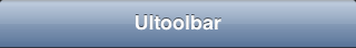
The toolbar element is a must have in any Emy project. It always stays on top. The toolbar contains the current view title, one DIV on the left which contains the back button, and a second div on the right in which you can put any other buttons.
The toolbar has a class "toolbar", and is the only direct body's childnode to stay on every views. In fact, it's not part of any view so that's why it does not translate or leave the viewport at any moment.
Title
The toolbar title is a h1 element with the current view's data-title attribute value. Each time the user navigates to another view, this h1 value is updated. That's why we strongly recommend to keep a text-overflow: ellipsis and a white-space: nowrap on it.
Back Button
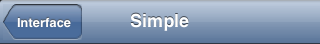
The back button is in the first DIV eleent, hidden by default on the first initial view, and shows up automatically when the user navigates to a view. Since the back button purpose is to navigate to the previous view, its label is automatically updated as the previous view data-title attribute's value.
When tapped or clicked, a selected="true" attribute is set for 300ms to simulate a click event, so you must always provide a visual callback with it.
Buttons on the right
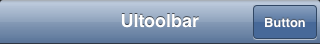
The second DIV (located on the right of the toolbar) is a place where you can put any additional buttons you want. To have a button style, you have to set a class button to any a element.
When tapped or clicked, a selected="true" attribute is set for 300ms to simulate a click event.
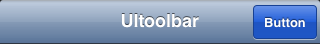
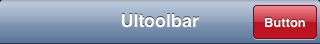
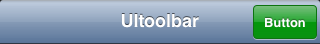
Emy comes with more than the default button style, you can set the class to button blueButton, button redButton or button greenButton
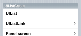
List
The list UI element is a normal UL / LI html element. It can be a list of text or links. Each list elements has a padding.
List link
Included links (a element) must have a negative margin equals to its parent li's padding.
Just like all tappable/clickable elements, the a element receives a selected="true" for 300ms when tapped/clicked. The arrow on the left of the link is created using a SVG as a base64 image. Huge benefit of SVG (rather than PNG) is that vectors looks good on retina displays too.
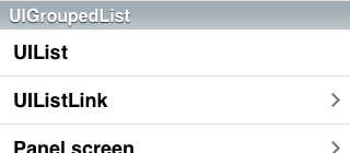
UIGroupedList
UIGroupedList is set by the "group" classname on the li element.
When inside a view having the panel classname, it might have a different look (iOS theme adds rounded corners on the first & last child and borders on left & right).
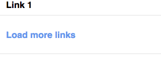
A very specific feature in Emy is the target="_replace" attribute on list links. Rather than make a link to a external file or go to another view, it loads the content of an url and “replace“ this link element by the url content (see this demo). Since it has a very different purpose than other links, we have to give it a different style.
In iOS theme, it has a bigger padding on top & bottom and a different color.
View
The view UI element is just a empty section element. It has no default style, and give no default style to elements in contains.
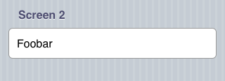
The view UI element can get the "panel" classname. iOS theme adds a padding around its content and a pinstriped background. The panel class interacts also with two elements: h2 & fieldset so if you design your own theme, keep in mind to support those two too, devs might need it.
Fieldset
The fieldset inside a view is just an element to include a list of rows in it. Each fieldset must have a margin on top and/or bottom to visually separate them.
Fieldset rows
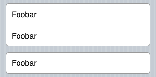
A row inside a fieldset is created using a DIV with the classname "row". You can have multiple of them and put whatever you want in it. Most common case is to use them for text of form elements. On the iOS theme, first & last child of a fieldset are given rounded corners.
Forms
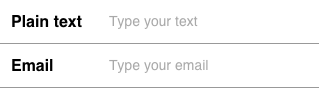
Forms are usually a big part of mobile web applications. That's why you have to be extra careful about how they look like and work. For example, we use a label element to show the name for the field, on top of the field. The field itself should always be 100% width so wherever the user taps the field, it focuses. The label element can have a for attribute equals to the field id attyribute (aka input element) to insure the field get the focused.
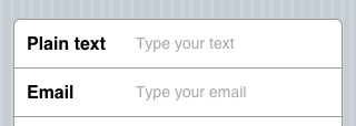
It has to works exactly the same in a panel view. (in iOS theme, we put the background color on the fieldset row, and not on the input field. It makes the radius easier to deal with).
Please note that HTML5 comes with new input types like "email", "url", "tel", "search", "number", "range", ... so do not use input[type='text'] to select elements in your styles. You can change how a field type looks like using the 'appearance' css parameter but keep in mind some input types may have a different look by platform.
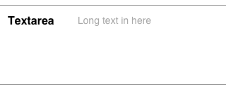
The textarea element looks just like the input field. That's why it always should be styled the exact same way.
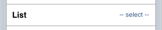
The select element is a very particular element. On the iOS theme, we give it a native look'n'feel but the browser's native select drop menu will still be used to select the value.
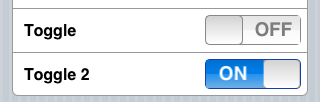
the toggle element is not something that exists in HTML. But since it's a pretty common kind of UI element in native mobile SDKs & applications, it's a must have. The toggle element is a DIV containing a hidden checkbox form element, and a span used as the indicator. "ON" and "OFF" labels are inside the CSS as before/after pseudo-elements of the indicator. CSS transition is used to make it toggle.
Additional notes
If you have some images you want to preload onload, you can put them as multiple backgrounds in the #preloader element style. This is particulary handy for click/tap styles on buttons to avoid missing image on the first click/tap. Of course, common CSS best practices also apply for Emy's theme (sprites, graceful degradation, css gradients, svg icons, ...) and the less external images number you need, the better (most of the time).
Styles are given by default by a emy.css. This file only specifies core CSS codes like border-box, width 100% for views, ... and the basic sliding transition code. All the rest is and should be inside the theme file(s). Please take a look at other themes we provide in the plugins/themes folder.
That's the beauty of CSS, you can totally add another CSS file for your app and overwrite or add some more styles. Emy comes has a base initial code you are free to customize as you want. Keep in mind core files (emy.css & themes css file) might get updated to fix bugs or enhance something, so it's always better to put custom changes in an external file to redefine styles rather than make modifications directly inside those core files.